
 The Colors are:
Honeysuckle link
Russet link
Coral Rose link
Regatta link
Peapod link
Blue Curacao link
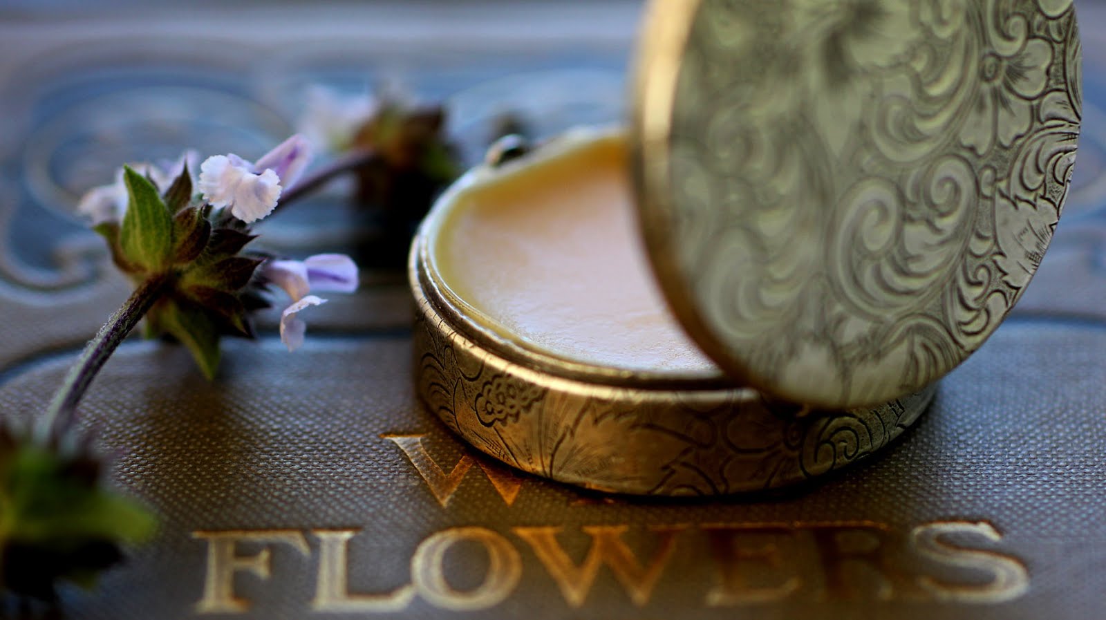
Beeswax link
Lavender link
Silver, Peony link
Silver Cloud link
The trend is featuring lots of complimentary neutrals juxtaposing each other with typical icons of Spring like: florals, whites, shades of blue evoking water and nautical, soft earthy tones, tribal with flow, adventure and far off lands, dreamy feminine, morphing realities and vagabond bohemia.

Since I have a color palette based on my own eye, skin and hair color triad I don't BUY according to what others dictate as the "latest" fashionable colors. I DO however pay attention to it as a designer and creator of imagery.
Of all the designers I am feeling most aligned with Carlos Campos palette harmonizes the best with my own, Rebecca Minkoff "ultimate vagabond" works well with my artistic creative and I rather like Monique Lhuillier inspiration of a "dreamy state of mind."
Lavender: Gracing the Dawn Natural Liquid Perfume

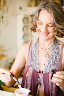
Beeswax: Mindful beekeeping here in the wooded hills for solid perfumes


Silver Peony: Vera Liquid Natural Perfume

Blue Curacao: GreenWitch Liquid Natural Perfume and upcoming solid


Blue Curacao: GreenWitch Liquid Natural Perfume and upcoming solid


No comments:
Post a Comment